前陣子 Adobe 和 Google 聯手各自用不同的名字釋出了一款新的中文黑體字形,Source Han Sans 思源黑體,也叫做 Noto Sans (反腐字?)。開心試用之後,把系統字形都換過來,也開始想要怎麼樣才可以達到最佳的顯示效果,尤其是 Adobe 和 Google 曾經給 FreeType 貢獻了 CFF 字形引擎的改進,思源黑體也是以 CFF 技術設計,終於可以試試看中文的效果怎麼樣了啊!
我這邊使用 FreeType 的工具程式 ftview 來測試不同參數設定下的顯示效果,同時也附上相對應的 FontConfig 設定。可以發現不同設定下的顯示差距還蠻大的:
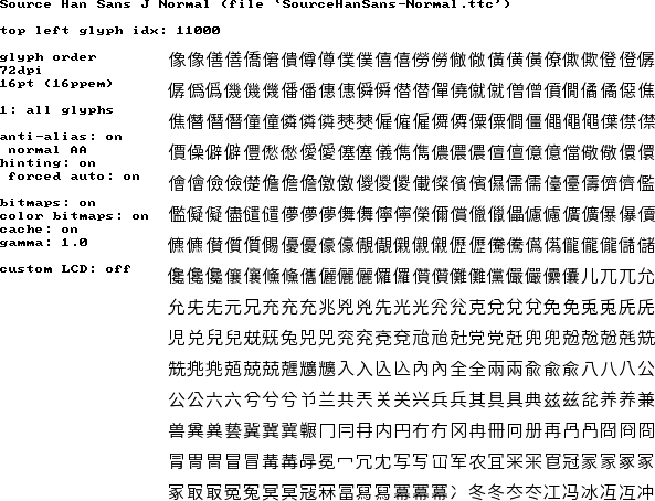
Auto-hinter, hintfull, grayscale anti-alias
首先是使用 FreeType 的 autohint, hintfull 其他用預設值,這應該是滿多人使用的設定,可以看到 autohinter 有很強烈的瘦身效果,把 Normal 的字變成幾乎是 Light 了。
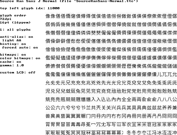
Auto-hinter, hintslight, grayscale anti-alias
再來是使用 hintslight,許多人用以取得類似 Mac 上面的渲染效果,卻不知道 hintslight 會自動使用 autohint,這張的效果和上面類似但是略為粗了一點。思源黑體使用 hintslight 的缺點是 Normal 變細,導致和 Bold 的粗細相差太多。
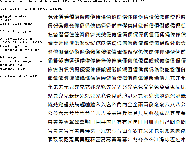
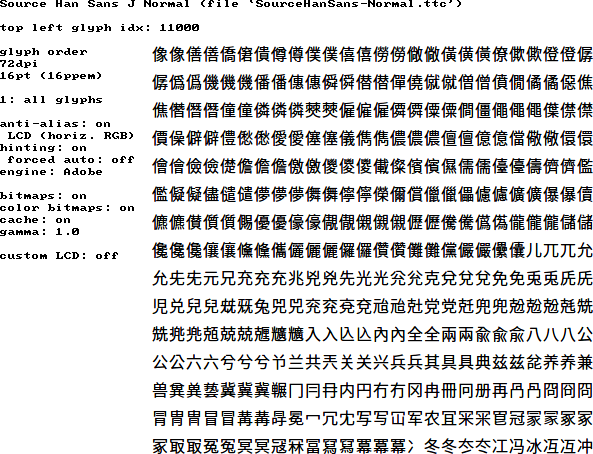
Auto-hinter, hintslight, RGB LCD subpixel AA
這張的效果和上面一樣,只是啟用了 subpixel AA 所以在螢幕是 RGB 排列的 LCD 的時候會有比較銳利的感覺。
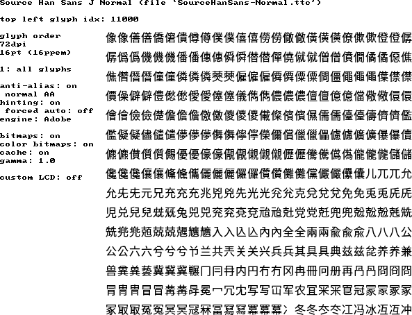
Adobe CFF native hinter, hintfull, grayscale anti-alias
這張則是使用 Adobe 去年貢獻的 CFF native hinting 引擎,這個引擎的特性是在小字的時候不但不會把字變細,反而還會加深筆劃讓字形看起來更清楚,於是 Normal 變回原本得粗細。
Adobe CFF native hinter, hintfull, RGB LCD subpixel AA
同上,只是啟用 subpixel AA 讓字形在 LCD 螢幕上看起來更銳利。
最後因為我選擇的設定是 TTF 字形使用 autohint + hintslight,CFF 字形則是使用 native hinter,因為雖然很多 TTF 字形有人工去 hint,可是一般來說 autohint + hintslight 比較可以保留細節,也不比人工 hint 差,而 CFF 字形因為有 Adobe 的加持,所以使用 native hinter 可以得到更好的效果。
    <match target="font">
      <edit name="rgba" mode="assign">
        <const>rgb</const>
      </edit>
      <edit name="hinting" mode="assign">
        <bool>true</bool>
      </edit>
      <edit name="lcdfilter" mode="assign">
        <const>lcddefault</const>
      </edit>
      <edit name="hintstyle" mode="assign">
        <const>hintslight</const>
      </edit>
    </match>
    <match target="font">
      <test name="fontformat"><string>CFF</string></test>
      <edit name="hintstyle" mode="assign">
        <const>hintfull</const>
      </edit>
    </match>
https://github.com/kanru/rcfiles/blob/fonts.conf
這是我目前的設定,至於你喜歡什麼樣的效果,可以再實驗看看各種不同的參數囉 ?